Design reference 47 · Retro & experimental
Colour Field
Make a site’s chapters legible through large fields of colour and simple spatial relationships.
Download design ZIP · Open interactive specimen
Design specification
Philosophy and fit. Make a site’s chapters legible through large fields of colour and simple spatial relationships. Suitable for cultural institutions, compact brand narratives, exhibitions, and design-led service portfolios.
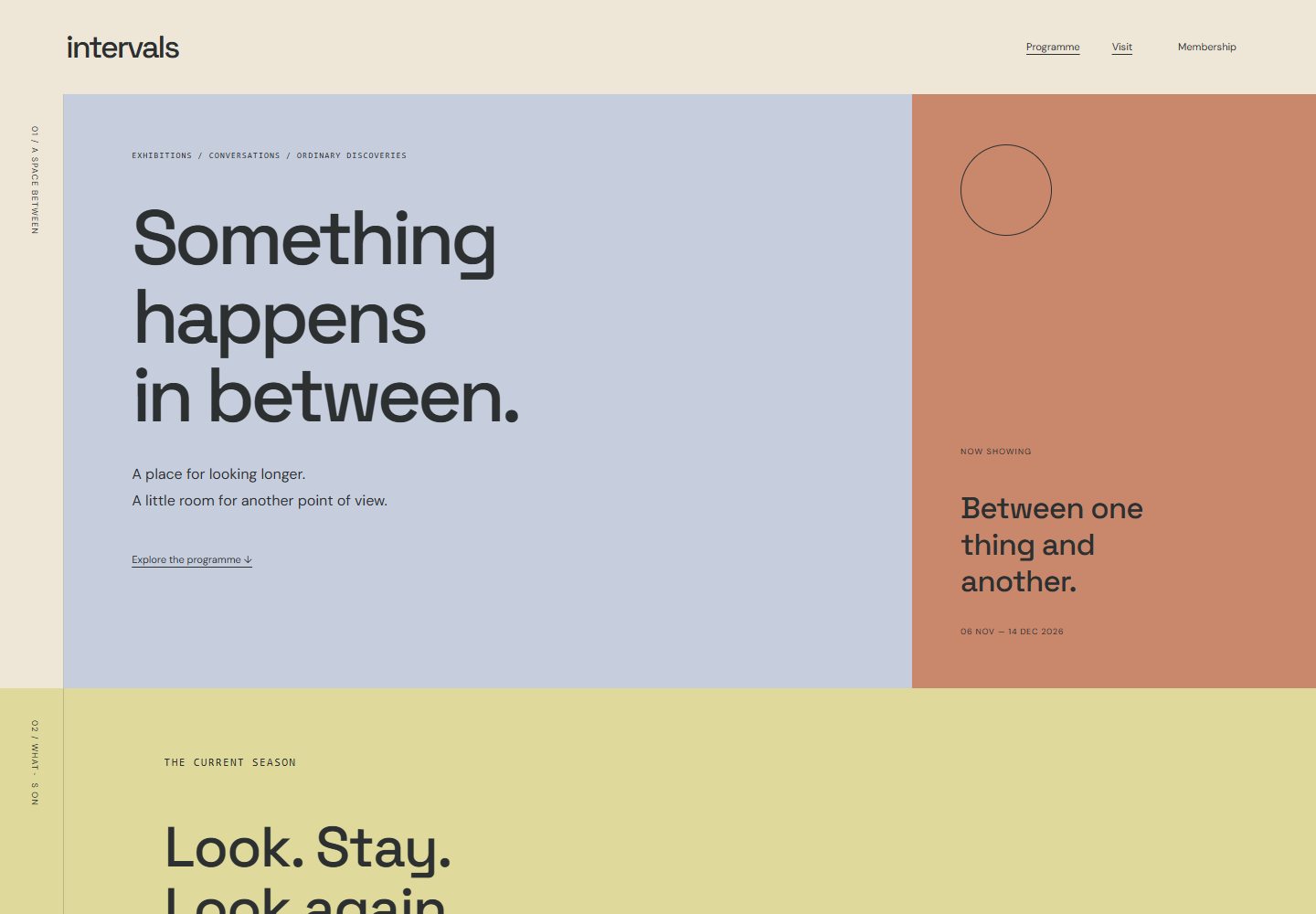
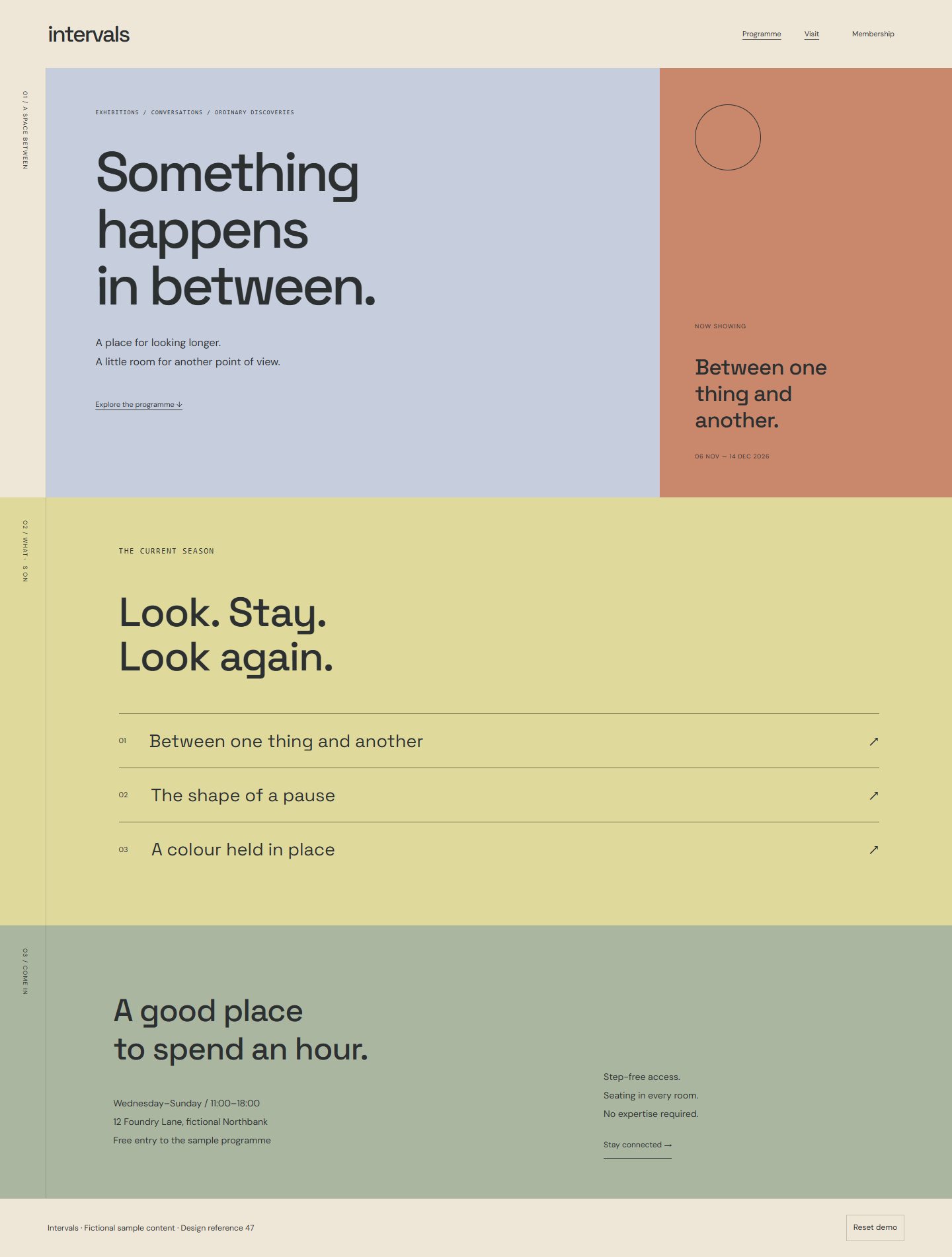
Visual grammar. Compose substantial flat-colour planes with sharp boundaries, sparse geometric markers, large headings, and deliberately limited image use. A chapter rail crosses these planes with a consistent navigation position. Typography stays restrained so the relationship between colour, proportion, and whitespace provides the identity. Each field includes a visible section label; colour never carries its meaning alone.
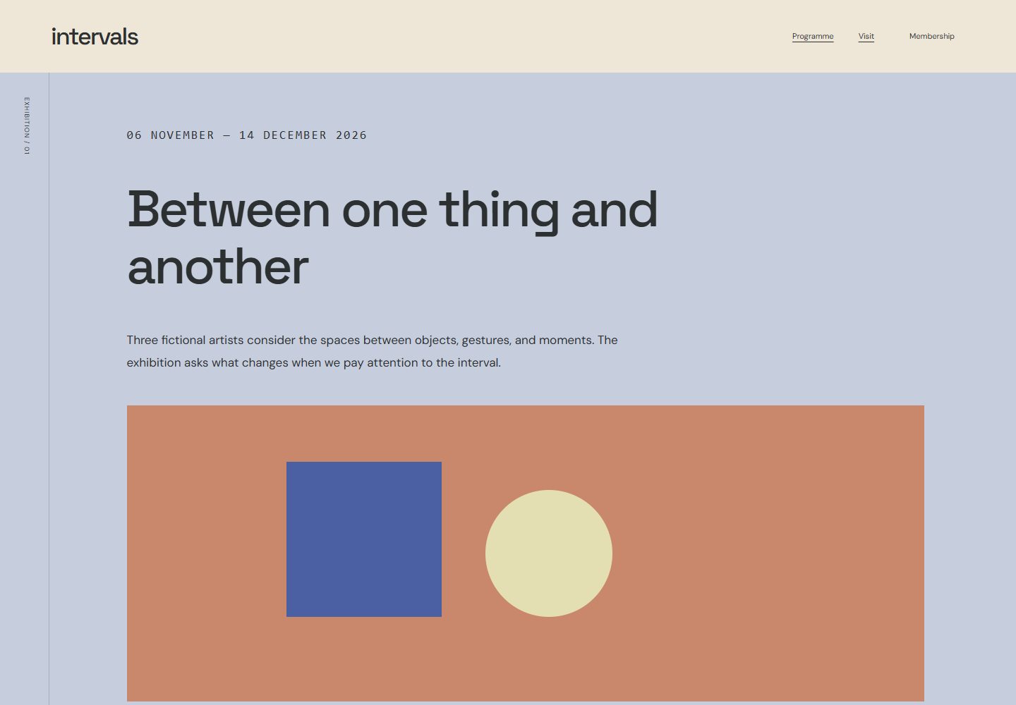
Specimen and flow. *Intervals* is a fictional exhibition space. Move between programme, visiting information, and membership chapters, then open an exhibition’s details. Supporting views are the complete exhibition index and a membership comparison laid out as aligned text columns.
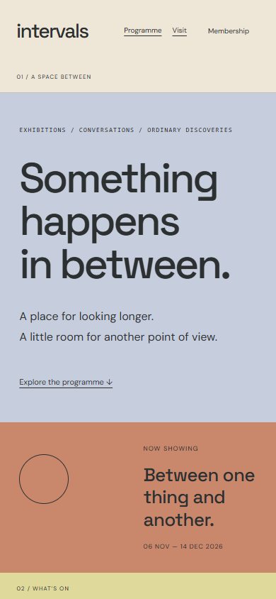
Mobile and motion. Turn side-by-side planes into an orderly vertical sequence. Keep ordinary scrolling and explicit anchor links; any transition simply fades between static compositions and can be disabled.
Identity and effort. Preserve large-scale colour composition; avoid shrinking the concept into many pastel cards or requiring full-screen snapping. Effort: medium.
Files for a coding model
Reference images
- Desktop — 1440 × 1000 viewport
- Phone — 390 × 844 viewport
- Supporting state — 1440 × 1000 viewport
- Full page — 1440 × 1000 viewport
Supporting routes
Reuse
Use and adapt the original code and specifications for personal or commercial work under MIT. Keep applicable font and photo notices. The ZIP includes the complete runnable reference and its local assets.