Design reference 07 · Clarity & editorial
Literary Review
Treat sustained reading as the main event.
Download design ZIP · Open interactive specimen
Design specification
Philosophy and fit. Treat sustained reading as the main event. Suitable for essays, criticism, literary magazines, personal publications, and thoughtful cultural commentary.
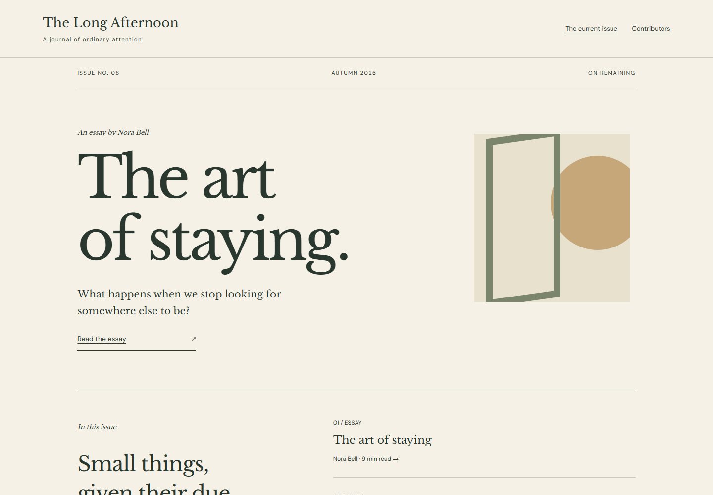
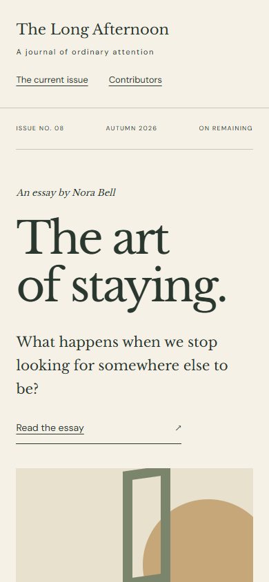
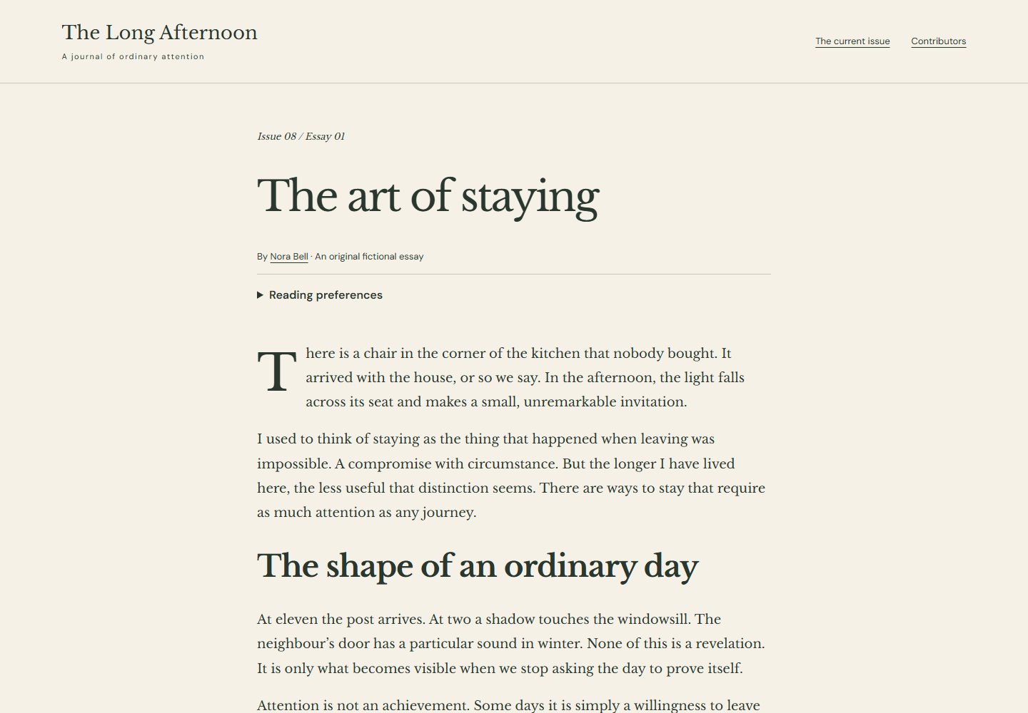
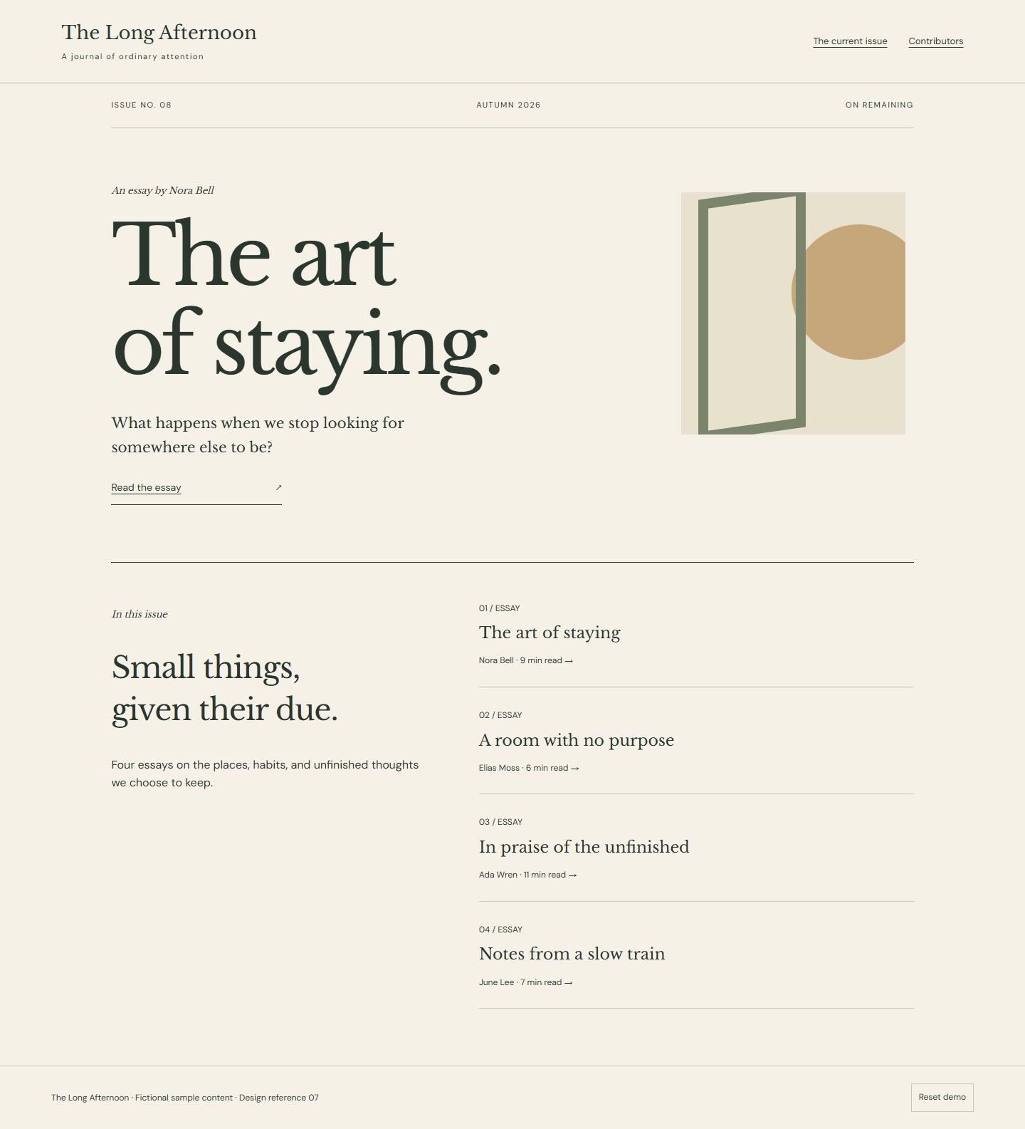
Visual grammar. An understated masthead opens into a current issue with one lead essay and a sparse textual contents list. Article pages use a generous book serif, a measured line length, clear paragraph rhythm, restrained drop capitals, and ample separation around section changes. Use ivory, charcoal, and muted forest accents. Navigation follows issues, authors, and subjects; small illustrations may punctuate reading without becoming the interface.
Specimen and flow. *The Long Afternoon* lets visitors browse an issue, open an essay, and continue to the next essay through a deliberate end-of-article link. Supporting views include an author page and a reader preference panel for text size and line spacing.
Adaptation and identity. Mobile protects reading width and keeps preferences simple. Preserve the cadence of essays and the identity of each issue; avoid scholarly annotation rails, news urgency, autoplay media, and constant related-content interruptions. Effort: low.
Distinctive composition. Literary italic captions replace the collection’s repeated monospaced label treatment. The review’s editorial composition is retained.
Files for a coding model
Reference images
- Desktop — 1440 × 1000 viewport
- Phone — 390 × 844 viewport
- Supporting state — 1440 × 1000 viewport
- Full page — 1440 × 1000 viewport
Supporting routes
Reuse
Use and adapt the original code and specifications for personal or commercial work under MIT. Keep applicable font and photo notices. The ZIP includes the complete runnable reference and its local assets.