Design reference 03 · Clarity & editorial
Swiss Grid
Build hierarchy through alignment, scale, and disciplined contrast.
Download design ZIP · Open interactive specimen
Design specification
Philosophy and fit. Build hierarchy through alignment, scale, and disciplined contrast. Suitable for conferences, studios, exhibitions, and editorial brands that want typography to carry their identity.
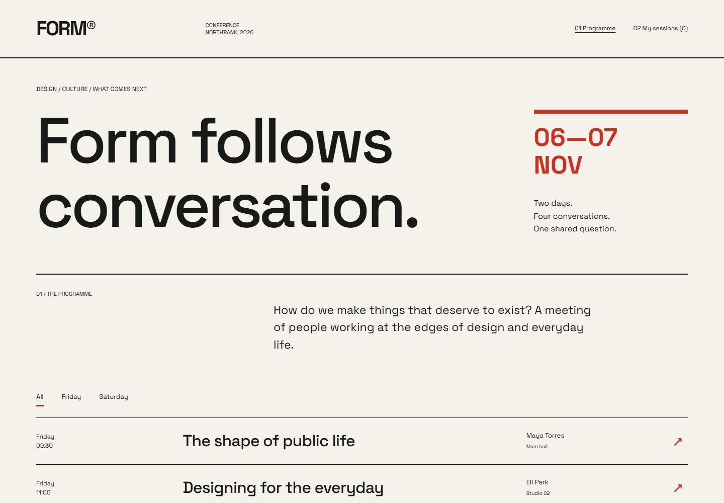
Visual grammar. Use a visibly rigorous grid, left-aligned oversized headings, numbered sections, generous outer margins, and restrained image crops. Small labels align with large type rather than floating in pills. A neutral sans works across a severe size range. An off-white ground, near-black text, and one vermilion accent organise the composition. Navigation is a short indexed list; rules and whitespace divide material instead of card backgrounds.
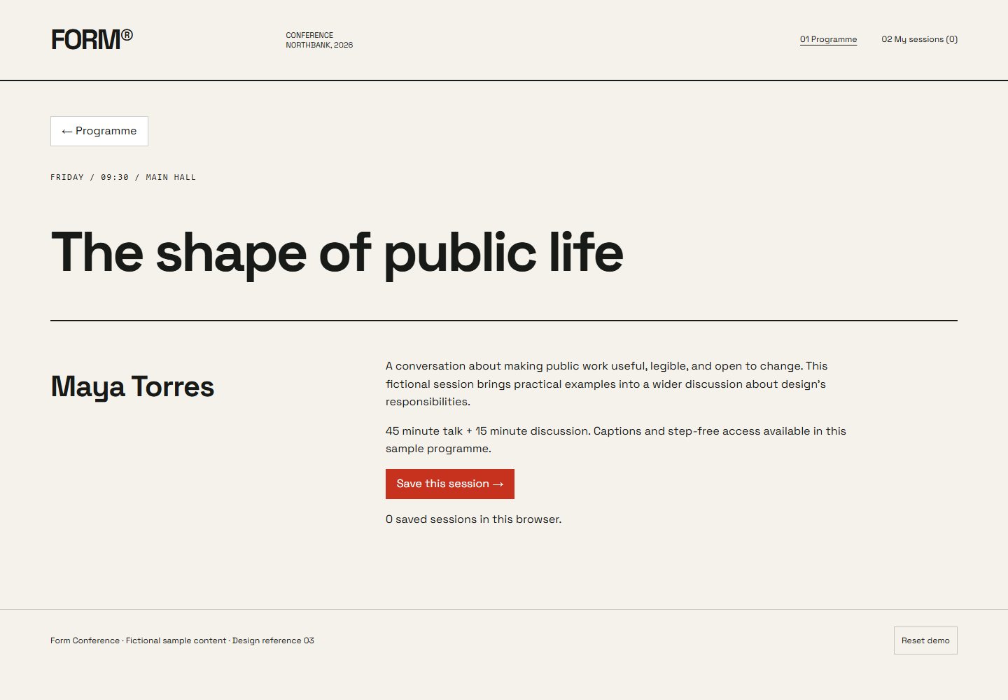
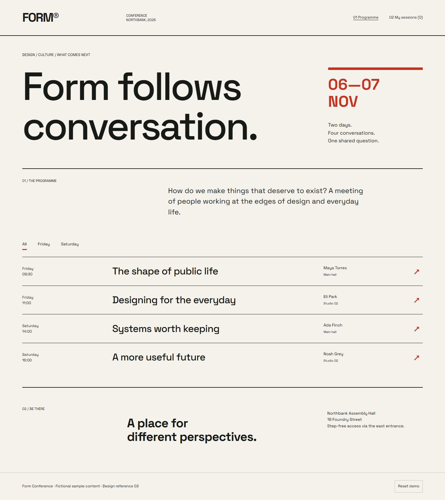
Specimen and flow. *Form Conference* lets visitors inspect the programme, filter sessions by day, and open a speaker profile. Supporting screens provide a programme detail with venue information and a saved-session list held locally.
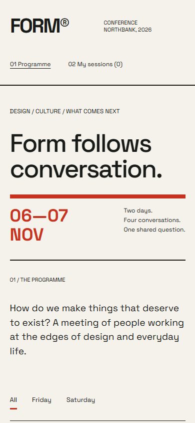
Adaptation and identity. On mobile, preserve alignment relationships while reducing the number of columns; the oversized heading must wrap deliberately. Preserve the grid and typographic hierarchy; avoid symmetric feature tiles, decorative shapes, and unrelated typefaces. Motion is limited to quiet state changes. Effort: low.
Files for a coding model
Reference images
- Desktop — 1440 × 1000 viewport
- Phone — 390 × 844 viewport
- Supporting state — 1440 × 1000 viewport
- Full page — 1440 × 1000 viewport
Supporting routes
Reuse
Use and adapt the original code and specifications for personal or commercial work under MIT. Keep applicable font and photo notices. The ZIP includes the complete runnable reference and its local assets.